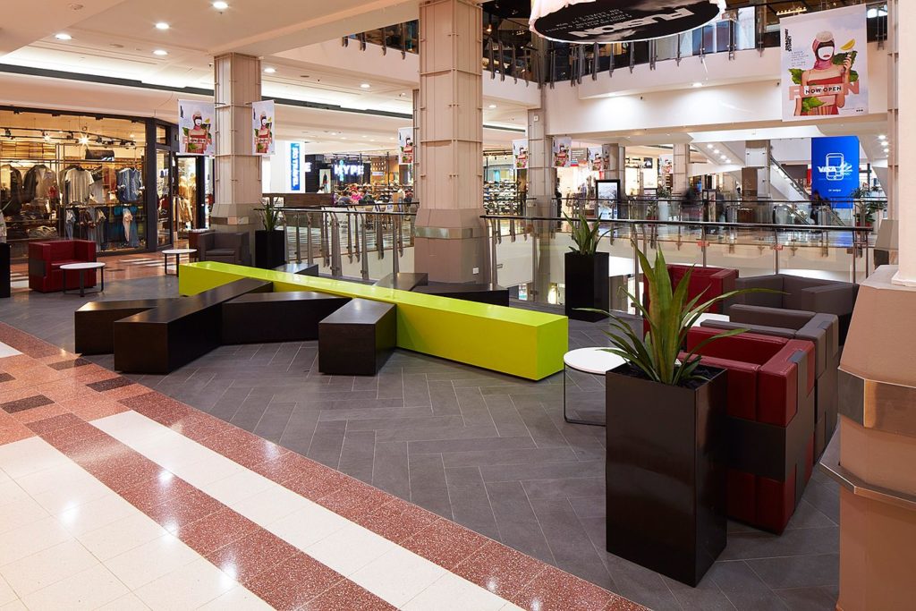
Broadway is characterised by a strong convenience based offer and is well trafficked – having the highest sales per square meter in Australia – but, the visit is usually an all too brief in-and-out. The masterplan intent is to extend dwell time into the evenings and to this end, the idea of a ‘food court’ in its traditional sense is scrapped. Replacing it is a social space with a programme of quick service restaurants, slower food experiences and fashion specialities.
The challenge set was to reconcile shopping and dining activities with the introduction of new to market retailers and a shift in food offer. Site constraints prompted a fusion of fashion and food offerings, no longer segregated in traditional precincts along a mall, but co-existing and relying on each other to deliver a greater richness of interest and promote exploration, a longer stay and continued use between mealtimes. This new typology generated a central social space modulated across its width to transition between differing functions. In realising this concept the spatial notion of a ‘mall’ was erased.
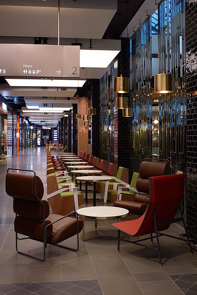
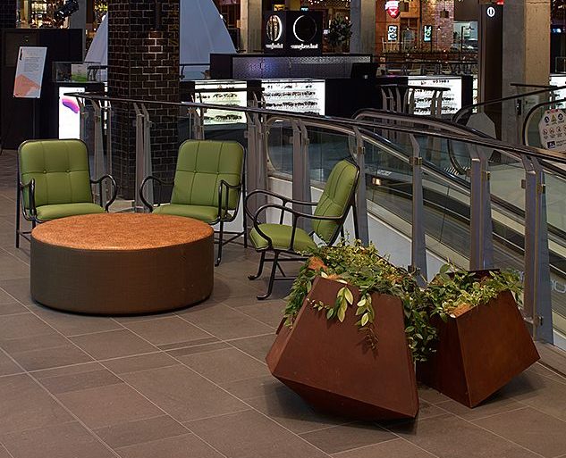
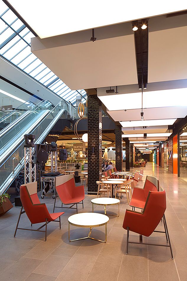
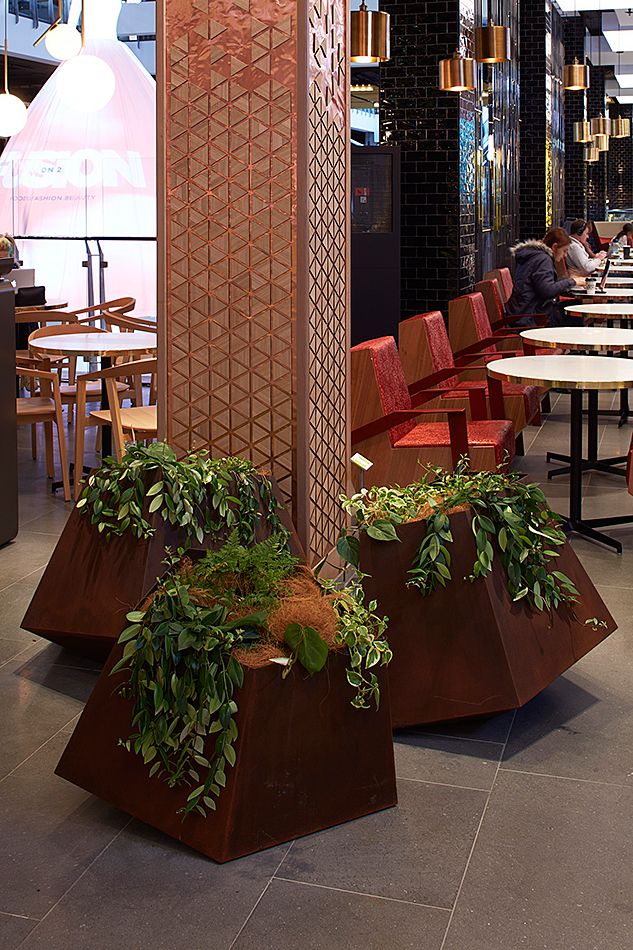
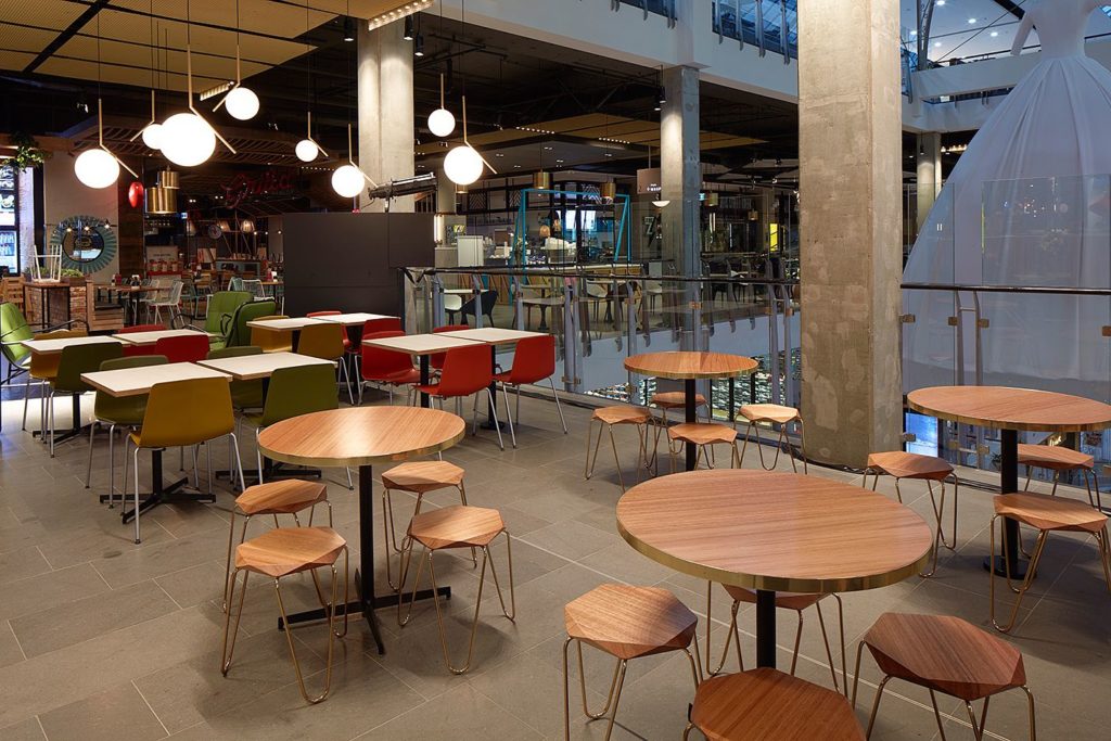
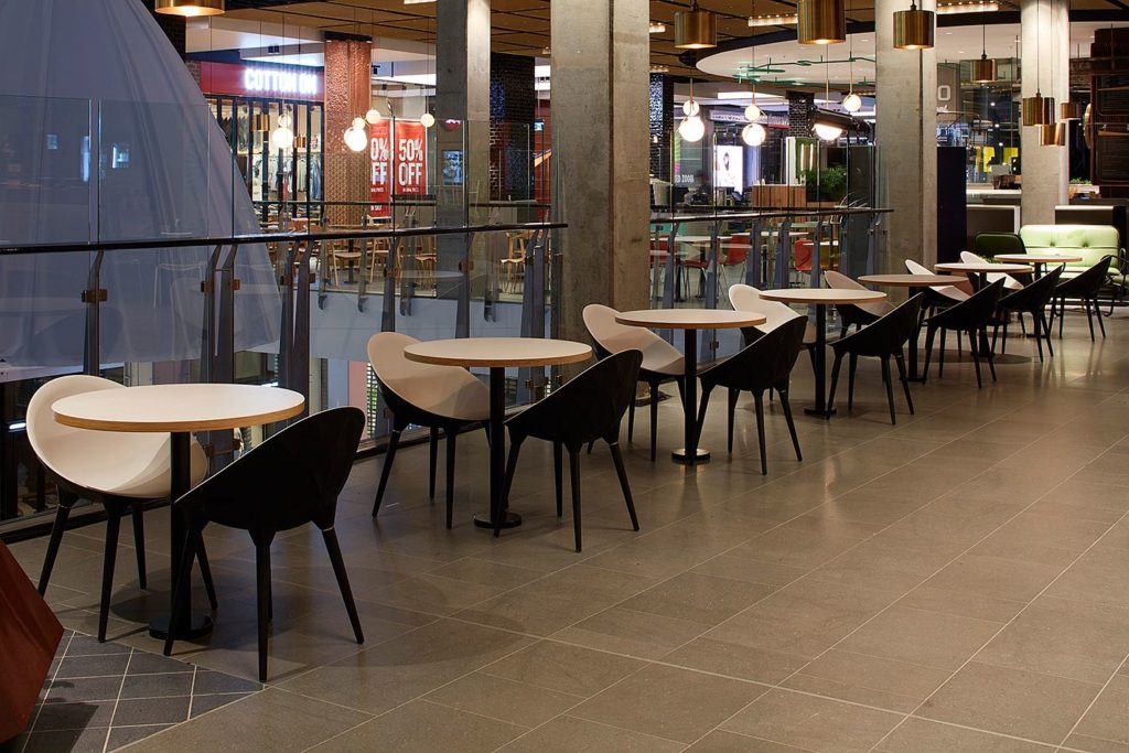
Three distinct but borderless zones create multiple choices for moving through the space. ‘Eat Street Laneway’, ‘Urban Room’ and ‘Fashion Street’ create opportunities to shop, rest, commune, promenade, observe, and dine. Differentiated character was articulated using: varying floor finish modules and textures; screening elements and ‘island’ kiosks that frame a more intimate scale; columns were stripped to their raw finish, sanded and sealed; soffits painted charcoal and services exposed; a variety of seating scenarios hosting differently sized groups, including licensed seating areas, encourage patrons to linger; feature ceiling acoustic panels improve comfort; a ceiling grid of gold anodised expanded metal sheets colours the space with warmth; fabric ceiling boxes are illuminated by changeable LEDs for events and promotions; and sites for public art encourage greater community engagement.
A strong concept document underpinned design direction and enabled the harmonious integration of all disciplines. The decision to strip back to base build and darken the ceiling void accommodated a highly adaptable response to coordination of an evolving brief. A strong palette and design language were established for the base build that was rigorously adopted by client teams implementing seamless tenancy design work into the precinct character.

